
The areas
The areas
The graphical user interface can be divided into different areas in order to describe the possible choices when setting selection criteria or showing analysis information. The following sections will describe what is visible for each of those areas and if and how the displayed information can be modified. We have labelled the different areas for your reference:

Figure: The different MyARM web browser areas (Click to enlarge)
Selection area
Besides choosing the time interval, the second most important decision is the number and order of levels you want to use for analysis. Just beneath the Group labelled "Configuration", you'll find a drop-down-box with several offers for the order of selections to perform.
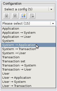
Figure: The selection order to choose
As you can see, we have selected "System → Application". This means that we first want to select the system (from which the measurements originated). After selecting the system, we'll be able to select the application (that generated the measurement data). The last step is necessary because there could be several ARM-instrumented applications running on the system selected. Please note that you'll always see the number of choices in parenthesis whenever possible, in this case there are 14 different choices for the analysis order.
According to our analysis order, the GUI provides a selection
for the system (the node where the measurements stem from). The
drop-down-box is labelled with the first possible system name, in
our case "myarm.info". The number 2053 tells
us that there are 2053 measurements available.
Clicking on the drop-down-box shows us that all measurements belong
to this system (there are no other names in the list):
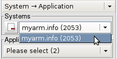
Figure: The system selection
The group labelled "Applications" is used for selecting the application we are interested in. Clicking on the drop-down-box shows us that there are measurements for two applications, named "PyCDDB" and "httpd":
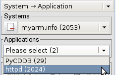
Figure: The applications selection
So we now know that there are 29 measurements for
"PyCDDB" and 2024 for "httpd". As
should be expected, at the end the numbers add up:
29+2024=2053 measurements in total as shown in the
first step when selecting the available systems.
The filters (in our case for Systems and Applications) and the Transaction attribute filters will be described later on in this document.
Result area
All measurements are conveniently displayed in a table. Depending on your choice for the order and kind of selections (in our example "System → Application") you'll see a slightly different set of columns. Clicking on a column header will sort all entries by the column selected. The default is to sort by the start date ("StartDate"). The direction used for sorting is indicated by drawing the associated arrow head in black:
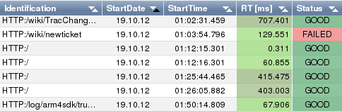
Figure: Result table sorted by "StartDate"
As you can see, an arrow pointing up means that the sorting is performed in increasing order (from lowest to highest).
The columns named "StartDate" and "StartTime" should be obvious, they tell you the date and time when this particular measurement started.
The column named "RT" (response time) is a little bit more interesting. Please note that two colors have been used in this table (for the column): a light green color for most of the cells and a darker color for 5 of the cells. The number in the cells shows the response time for the measurement (in the unit selected by you; here, the default is used, which is milliseconds). As you might have guessed already, the hue tells you something about how "slow" this particular measurement is. Scrolling in the sidebar will explain everything:
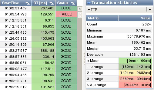
Figure: Transaction statistics
As you can see, the response time has been classified according to the distance from the mean value. In our case, the mean is 160.462 ms. So, the cells with a light green background have response times up to the mean value. Those with a dark green background have response times within one standard deviation. In the MyARM GUI, we only consider values at the right of the mean value (so technically, this is not really a 1-σ interval).
Please note that the choice of the Normal distribution as underlying model is somewhat arbitrary – it is very probable that your data does not really apply to this model. Then again, in our experience using the Normal distribution is practical anyways. Later versions of the MyARM GUI will probably let you chose the statistical model on which the statistics are computed.
Sidebar area
The sidebar is shown at the right side of the results table. The sidebar is a container for up to four panels containing information regarding the results displayed in the results table. As you have seen in the previous section, one of the panels is labelled "Transaction statistics".
The other panels deal with the frequency of occurrence of different transaction types ("Transaction distribution"), information about dropped transactions ("Transactions dropped") and details related to the measurement selected in the results table ("Transaction details").
Bottom view area
The bottom view area is used to present additional information
about loaded transaction measurements. Depending on the graph/tree
icon state ( /
/  ) within the "Icon bar area" a
tree representation of the currently selected transaction or a
scatter diagram of all loaded transactions is displayed.
) within the "Icon bar area" a
tree representation of the currently selected transaction or a
scatter diagram of all loaded transactions is displayed.
Tree view area
This area is used to show several transactions that are connected via parent-child relations in a way that highlights the order in which those related measurements happened. You can choose one of three different diagrams: transactions as stacked blocks, a sequence diagram or a diagram highlighting the parent-child relation via indentation in a textual table.
As you can seen, a tab named "Overview" has been selected. The diagram within depicts three levels of transactions: a "HTTP" transaction, which is the root transaction. This means, that for this particular depiction, processing started with this transaction.

Figure: The tree view (Click to enlarge)
The box with orange background color represents the transaction "CDDB-Query" which started approximately 260 ms later than the parent transaction ("HTTP"). "CDDB-Query" itself is also a parent transaction that has started two child transactions: "DB-Connect" and "Generate-Output". The box with blue background is too small to display a label, so you have to look up the color mapping in the Diagram area described below. What you can see is that "CDDB-Query" uses up little response time itself, almost all of the time is used up by its child transactions.
Finally, the large box at the top has combined all transactions by drawing them superimposed in a logical manner: You don't see the orange color for the transaction "CDDB-Query" because the first child transaction starts at almost the same time as the parent and the second child transaction stops at almost the same time as the parent transaction.
Diagram area
This area is used to visualize statistical information for the transactions shown in the "Tree view area".
You can see that in the "Diagram area" the tab named "Trans" has been selected. This shows the frequency of occurrence for the transactions shown in the tree view diagram at the left. "HTTP" takes up most of the total response time of 354 ms, "DB-Connect" and "Generate-Output" are runners-up with 11% and 6.4%, respectively.
Please note that "CDDB-Query" uses only up 0.2% of the total response time: as noted above, this transaction does almost nothing itself, all of the work is done by its child transactions. Thus the tiny number.
Scatter diagram area
Depending on the graph/tree icon state () within the "Icon bar area" a
scatter diagram of all loaded transactions is shown in the bottom
view.
- The scatter diagram is grouped by transaction definitions which defines data series within a scatter diagram. If transactions with different definitions are loaded the appropriate data series can be enabled or disabled by clicking the checkbox on the right of the scatter diagram.
- Each data series has an associated color which is used either in the scatter diagram and in the transaction table above the scatter diagram.
- A selected transaction within the transaction table is shown in
the scatter diagram with a black circle and a line down to the
x-axis.

Figure: The scatter diagram - an overview (Click to enlarge) - Title editing: the title checkbox is used to enable (checked) or disable (unchecked) drawing of a title within the diagram. If enabled the title text can be changed by clicking the text rendered in light gray beside the title checkbox. A line edit will be displayed allowing to change the title. To discard changes press escape, to confirm changes just press the return or enter key.
- Icon bar:

- Click icon to hide () or
show (
 ) a grid.
- Click icon to hide (
 )
or show () a legend within
the scatter diagram.
)
or show () a legend within
the scatter diagram. - Click icon to toggle between lines () or filled areas (
 ) for each data series.
- Clicking on this item will download the current diagram as a SVG file.

- Clicking on this item will open the diagram in a new browser window for printing. You can then print this diagram directly via your web browser menu.
- Click icon to hide (
 ) or
show (
) or
show ( ) the data series
table.
) the data series
table.
Using the mouse wheel it is possible to zoom in and out within the scatter diagram.
Icon bar
This bar is used to display a row of icons. Each icon has been configured to perform tasks you will probably frequently use. Most of the tasks triggered by clicking on such an icon are related to freeing up display area by hiding one or more of the areas described above.
Move the mouse cursor over the icons and keep it there for a short time in order to display a help message.
Figure: The icon bar

- The "Bookmark" icon is used to open a dialog window for
generation a URL to the current query settings. The generated URL
can be used to restore the currently displayed settings, query
results and layout settings.
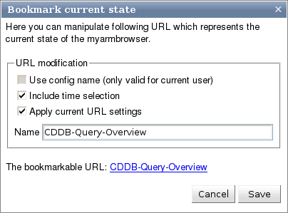
Figure: The bookmark dialogThe following three check boxes can be used to modify the behaviour of the bookmarked URL:
- If a predefined configuration (as described in section "Working with configurations") is active enabling this check box will use the configuration name instead of using a snapshot of the current view. This will enable the current user to bookmark a specific configuration. But other users can not use this bookmark.
- If checked the current selected time period is used within the bookmark so that the current view can be exactly restored.
- If checked loading the URL will directly apply all settings thus loading all data instead of setting only all selections.
The "Name" is used to enter a descriptive name for the bookmark as shown in the link below: "CDDB-Query-Overview".
Clicking the "Save" button will save the bookmark URL into the database. The bookmark works only after saving it into the database. Clicking the "Cancel" button will reject the bookmark URL.

- The "Selection" icon will toggle the visibility of the
"Selection area" displayed on the left of the browser
window. If the corresponding area is visible, the icon will have a
red minus-sign (), a
green plus-sign (
 ) in
the icon indicates that the selection area will be displayed upon
clicking on the icon.
) in
the icon indicates that the selection area will be displayed upon
clicking on the icon. 
- The "Bottom view" icon will toggle the visibility of the
"Bottom view area" displayed at the bottom of the browser
window. If the corresponding bottom view area is visible, the icon
will have a red minus-sign (), a green plus-sign (
 ) in the icon indicates that the
tree view area will be displayed upon clicking on the icon.
) in the icon indicates that the
tree view area will be displayed upon clicking on the icon. - The "Bottom view" can either show scatter diagrams of the
currently loaded transaction measurements or a tree representation
of the currently selected transaction measurement. To toggle
between these two views use the graph () icon to switch to the scatter diagram
view and the tree overview ()
icon to switch the the tree view.

- The "Sidebar" icon can be used to toggle the visibility of the
"Sidebar area" displayed on the right of the browser window.
If the corresponding area is visible, the icon will have a red
minus-sign (), a green
plus-sign () in the icon
indicates that the area will be displayed upon clicking on the
icon. If all sidebar panels are not visible the icon is displayed
in gray. Clicking on the icon has no effect and the help text
indicates this by including the text "(disabled)".

- The "Transaction details" icon will toggle the visibility of
the "Transaction details" panel. If the corresponding
panel is visible, the icon will contain a red cross (
 ), an icon without cross () will display the corresponding
panel.
), an icon without cross () will display the corresponding
panel. 
- The "Transaction distribution" icon will toggle the visibility
of the "Transaction distribution" panel. If the
corresponding panel is visible, the icon will contain a red cross
(
 ), an icon without cross
() will display the
corresponding.
), an icon without cross
() will display the
corresponding. 
- The "Transaction statistics" icon will toggle the visibility of
the "Transaction statistics" panel. If the corresponding
panel is visible, the icon will contain a red cross (
 ), an icon without cross
() will display the
corresponding.
), an icon without cross
() will display the
corresponding. 
- The "Dropped transactions" icon will toggle the visibility of
the "Dropped transactions statistics" panel. If the
corresponding panel is visible, the icon will contain a red cross
(
 ), an icon without cross
() will display the
corresponding.
), an icon without cross
() will display the
corresponding.